.webp)
Show us a startup founder whose brand wasn’t one of the last things on their list, and we’ll either show you a rare unicorn or someone who’s not being completely honest.
Well, we’ll be honest! Back in 2018, when we were introducing HowNow to the world, we put together something pretty damn quick. And it’s fair to say that wasn’t a good representation of what we were then, and it’s certainly not who we are four years later.
That’s why we’re so excited to talk you through our brand refresh…
Don’t get us wrong, we always had a vision of what HowNow stood for, but it’s even clearer now!
From the get-go, our goal has been to create social and collaborative learning experiences that engage people and help them/their business grow. And that mission is at the heart of our new logo:
It’s our tagline for a reason, but these are all crucial elements of how people learn now! Without them, you struggle to engage learners, and without learner engagement, your L&D efforts are destined to fail.
How do we know? Because we’ve spent more than four years driving learning at massive multinational companies, forward-thinking scaleups and fast-growing startups!
And when people are engaged, you see all of those elements in our logo: raised hands, smiling faces and people working side-by-side to build knowledge. These are your building blocks to closing the Engagement Gap!
Something else we saw in our years of watching people learn is that engaged learners engage with content! They circle, they highlight, they annotate, the underline – proving that the pen really is mightier than the sword, especially when it comes to learning.

These are the elements we wanted to capture in our new brand because our goal is to represent how people learn now – in every sense of the word.
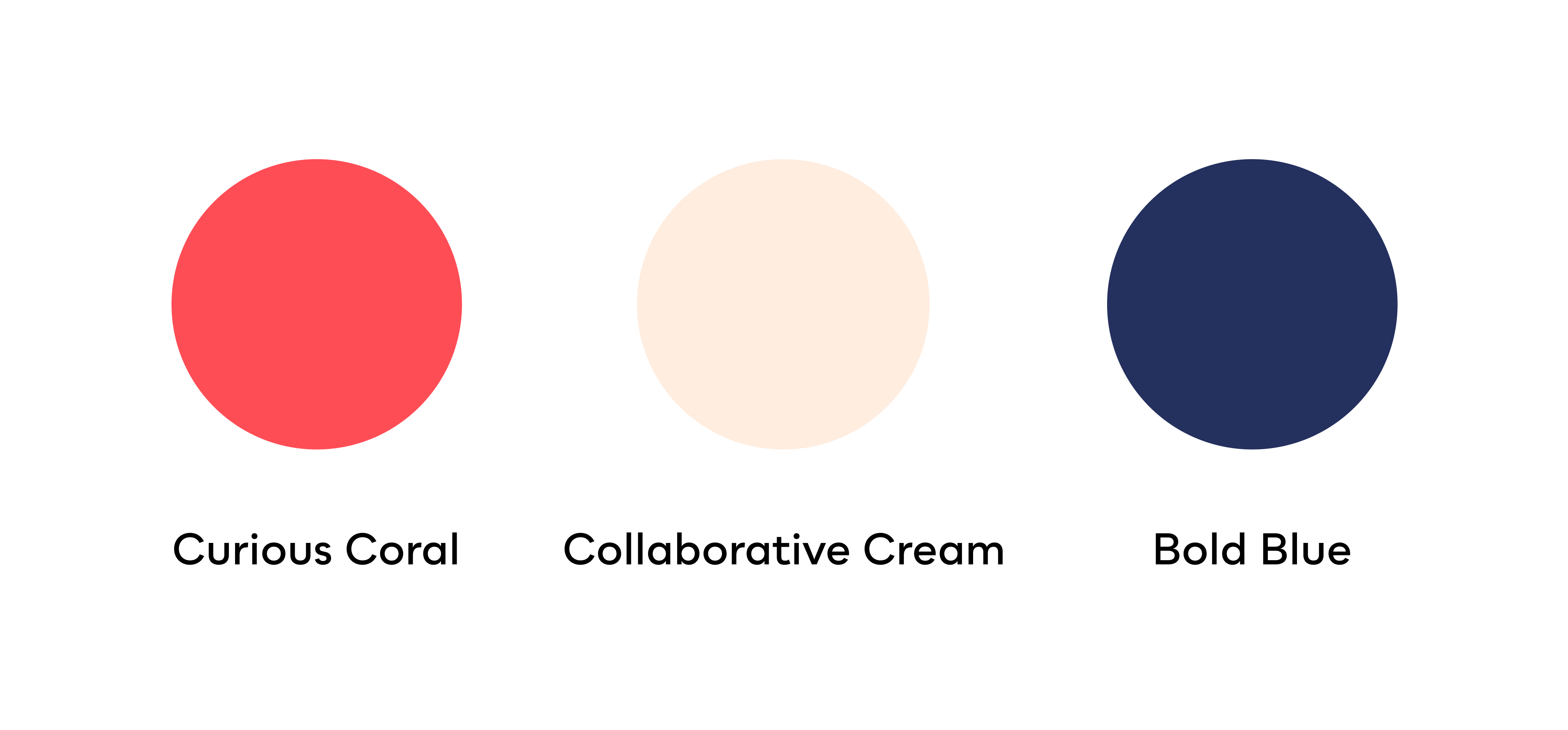
Has anyone ever given you that compliment? Feels great, doesn’t it! That’s what we wanted with our new colour palette, shades that really fit with and showcased all the elements we’ve discussed so far.
Ironically, our last colour palette didn’t really collaborate very well with certain backgrounds or the other tones that made it up! So the goal was to create core colours that showcased HowNow’s vibrancy, but were more subtle and easily paired with others.
And to truly cement them as our new colours, we named them after three of our core brand values: Curiosity, collaboration and boldness.
Is it really a brand refresh without a sketch to kick it all off? Behold the famed notebook pages of our CEO, Nelson Sivalingam! These early drawings came after speaking with our customers, asking them to explain their perception of HowNow and what the brand means to them.
After he’d put pen to paper, we put the feelers out there to design agencies and freelancers, to see if they could bring it to life.
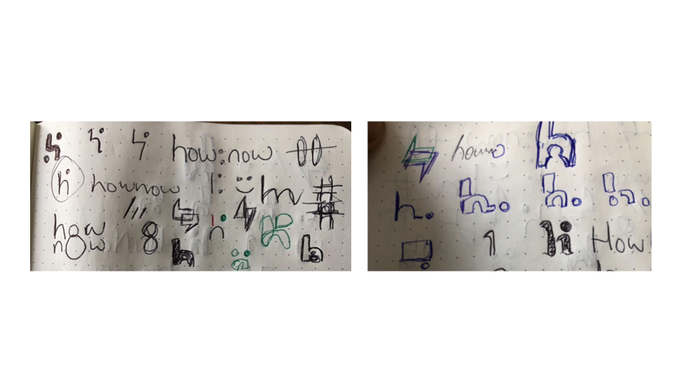
And there were no hard feelings, but this was just one of those times where it felt like doing something properly meant doing it yourself! Their mockups were great, but they just couldn’t capture the essence of HowNow in the same way someone working here could…
That’s when our amazing product designers, Ashish Soundalkar and Omkar Nilapwar, stepped up! Having lived and breathed HowNow (and put plenty of blood, sweat and tears in too), they understood our mission, knew what our brand felt like and had the skills to bring it to life.
With some great input from our Marketing Team, they’ve created a brand identity that captures what it’s like to work at HowNow AND be one of our forward-thinking, innovative customers – no mean feat at all!

Our CEO, Nelson Sivalingam, summed up our brand journey perfectly:
“When you’re starting out, the brand identity is probably the last thing you’re thinking about! And so you create something that suits you at the time, but doesn’t necessarily convey what you stand for. That’s where we were in 2018…
“Today, we’ve got a clearer vision of who we, what we stand for and, most importantly, who we’re for!
“We’ve learnt all of this over the last four years, and it felt like the perfect moment to build a brand that reflected our growth, mission and people.
“From our logo and colours to the little touches like sketch notes, this refresh captures how people learn now! Social, collaborative, bold and innovative, we’ve now got a brand that reflects who we are and what we do.”
%20(1).webp)
.webp)
.webp)
.webp)
.webp)
.webp)
